Choosing the Perfect Typography

Whether you are using a billboard, digital sign, or vehicle wrap to advertise your business, choosing the right typeface and font to display your brand message to the world can be a challenge. Typography (the style and appearance of printed matter) often provides that at-a-glance first impression, so your signage choices need to be appropriate. Is your font saying “play date” when it should be saying “job interview”?
Bad typographic choices distract from your design’s message and intentions, so it’s important to get this right. There are literally thousands of fonts and designs to choose from, so following are some tips to help you narrow down your choices and choose the right typography for your project.
-
Brainstorm the qualities or characteristics you want to communicate.
What mood are you trying to set; playful, serious, casual, elegant? Choose a font that is in line with that mood. You could use ComicSans to advertise a day care center, but probably not a Wall Street law firm, for instance. Be sure that your choice supports the personality of your brand.
-
Be careful when using unusual typefaces, such as display and/or decorative choices.
A little goes a long way here. These should be used sparingly in most cases, and are not a wise choice for large amounts of text, as they tend to be hard on the eyes. They are meant to be used in headlines, labels or short bursts of text, not paragraphs.
-
Combine typefaces carefully. If you choose to use two or more typefaces, be careful with your combinations.
Use two typefaces with significantly different weights, combine a display typeface with a san serif, or use different weights/styles within the same typeface. Don’t go overboard here; one or two typefaces are probably enough. Remember, sometimes less is more. Unless you are striving for a jumbled, chaotic look, keep it to one or two font choices.
-
Readability is key.
This may be obvious when designing a message that you want people to read, but it is all too easy to get caught up in all the creative choices available when designing your sign. Some typefaces are easier to read than others, and you need to keep in mind where your message will be seen. Script on a billboard or car wrap is probably not a good idea, since your audience is most likely to be driving when they see your sign.
-
Color combinations make a difference.
Researchers have discovered impulsive buyers tend to respond to black, red-orange, and royal blue. Spendthrifts respond best to sky blue, navy, teal, and pink. Conservative ones react to pastels like baby blue, pink, and rose. When it comes to signage, red is a strong, stand out color that conveys a sense of urgency (good for clearance sales), blue tends to be the color preferred by men, and orange and yellow are cheerful colors that promote optimism. Be careful when placing light text against a dark background, since most typefaces were designed to be printed with black ink on a light background. Choose a typeface that is large and bold for clarity, and the less decorative, the better.
There are many choices when it comes to designing the perfect signage for your business, and the experts at Big Picture Graphics can help you choose the best way to get your message across. Give us a call today at (720) 881-3988 or shoot us an email at info@bigpicturegraphics.com. We look forward to helping you grow your business by getting your message out there in the most effective way possible.
 How Your Paint Can Impact Your Vehicle Wrap – What to Know
 How to Wash a Vehicle With a Car Wrap – What to know
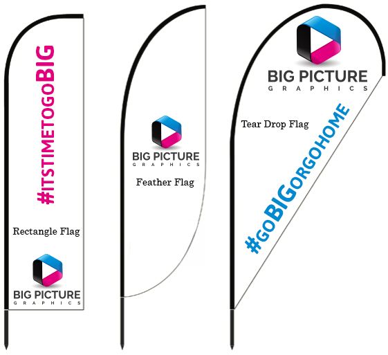 Did You Know Big Picture Graphics Makes Banners?
 Congratulations to our Q1 Employee of the Quarter – Kurt Green
 5 Business Sign Mistakes to Avoid